While at ODD, I worked as part of the creative team on Eastpak’s first global brand campaign. My role focused on shaping integrated ideas with the copywriter — developing the creative platform that positioned Eastpak as the backpack of choice for urban life.
We built the campaign around two core ideas: pack the story (which informed a new brand manifesto) and pack the city (the foundation for a series of activations and content). The work came to life across global OOH, social and digital — a mix of bold, graphic storytelling and simple, engaging ideas that travelled well across markets.
It was an exciting campaign to see roll out at scale, and a project that still reflects the clarity and energy I bring to brand work today.
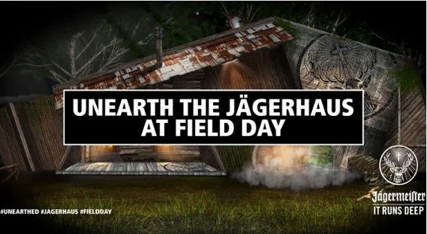
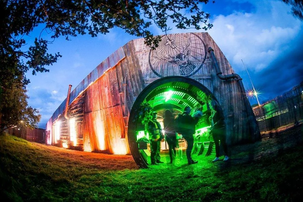
While freelancing for music and entertainment agency FRUKT, I co‑created Jägermeister: Unearthed with my creative partner - a concept built around discovery, ceremony and experience.
Our idea went on to win the pitch, becoming a £1m activation that launched and toured major UK festivals throughout summer 2015, continuing into 2016 due to its success. Festival‑goers could “unearth” different musical experiences hidden inside the Jägerhaus — a woodland‑set structure that acted as a home for live sessions, secret sets and brand moments at festivals including Field Day and Bestival.
The Jägerhaus was designed to reconnect people with the brand’s heritage and shift perceptions beyond the Jägerbomb. One of the key objectives was to encourage a move towards long‑serve drinks, including Route 56; a long drink served in a ceremonial glass to re‑establish a more authentic relationship with the brand.
I spent several months working on social and content for Dr. Martens — a mix of fast‑turnaround ideas, cultural moments and deeper storytelling that tapped into the brand’s heritage.
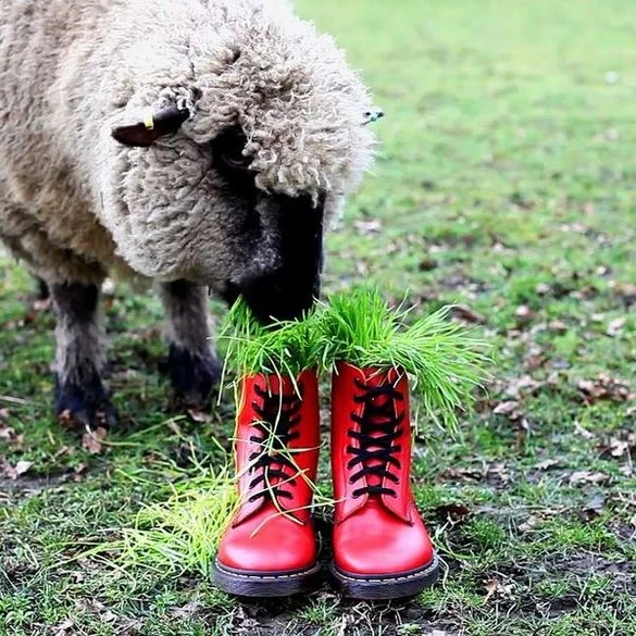
One of the most memorable pieces was for Chinese New Year. We didn’t want to fall into cliché or tokenism, so we worked directly with members of the community to sense‑check the idea and make sure it landed with the right balance of irreverence and respect. The final concept - a sheep eating out of a pair of bright Red Lucky DMs - sounds wild written down, but it struck exactly the right tone. It became the best‑performing post of the year at that point, precisely because it felt playful and culturally aware.
At the other end of the spectrum, I spent time researching the American Hardcore scene and building a relationship with photographer Edward Colver. That work allowed us to create a bank of authentic, culturally rooted content to launch a new range — something that felt true to the brand’s history rather than a surface‑level nod to subculture.
It was a period of work that moved between the quick and the considered, the irreverent and the deeply researched — and it taught me a lot about how to keep a brand’s voice sharp while still evolving it for new audiences.
I met the director/producer duo behind Siren just as they were taking the first steps toward building their own production company. From there, I worked with them to develop the name, brand identity and a fully responsive website — all of which is now live.
The challenge was twofold: they needed to stand out in a crowded field of production‑company portfolio sites, while also signalling the high‑end, art‑driven work they wanted to attract. That balance shaped the entire identity.
We designed the logo to be razor‑sharp and memorable, and built the website to be image‑led with a sense of play and discovery. I developed the UX so content could slide in from unexpected points on the page, giving the site a subtle cinematic quality. I also established eight breakpoints to ensure the work displayed at the highest possible resolution across devices. Every asset — from bespoke project titles to image treatments — was created with the same level of precision the team brings to their films.
That rigour became a defining part of the brand. It was exciting to translate their meticulous approach into a digital platform that felt both refined and distinctive.
The site did exactly what it needed to: clients repeatedly fed back that it was the deciding factor in commissioning the team. As their workload grew, I continued to support them — overseeing the design of a CMS‑driven platform that still holds onto the core principles of the original identity.
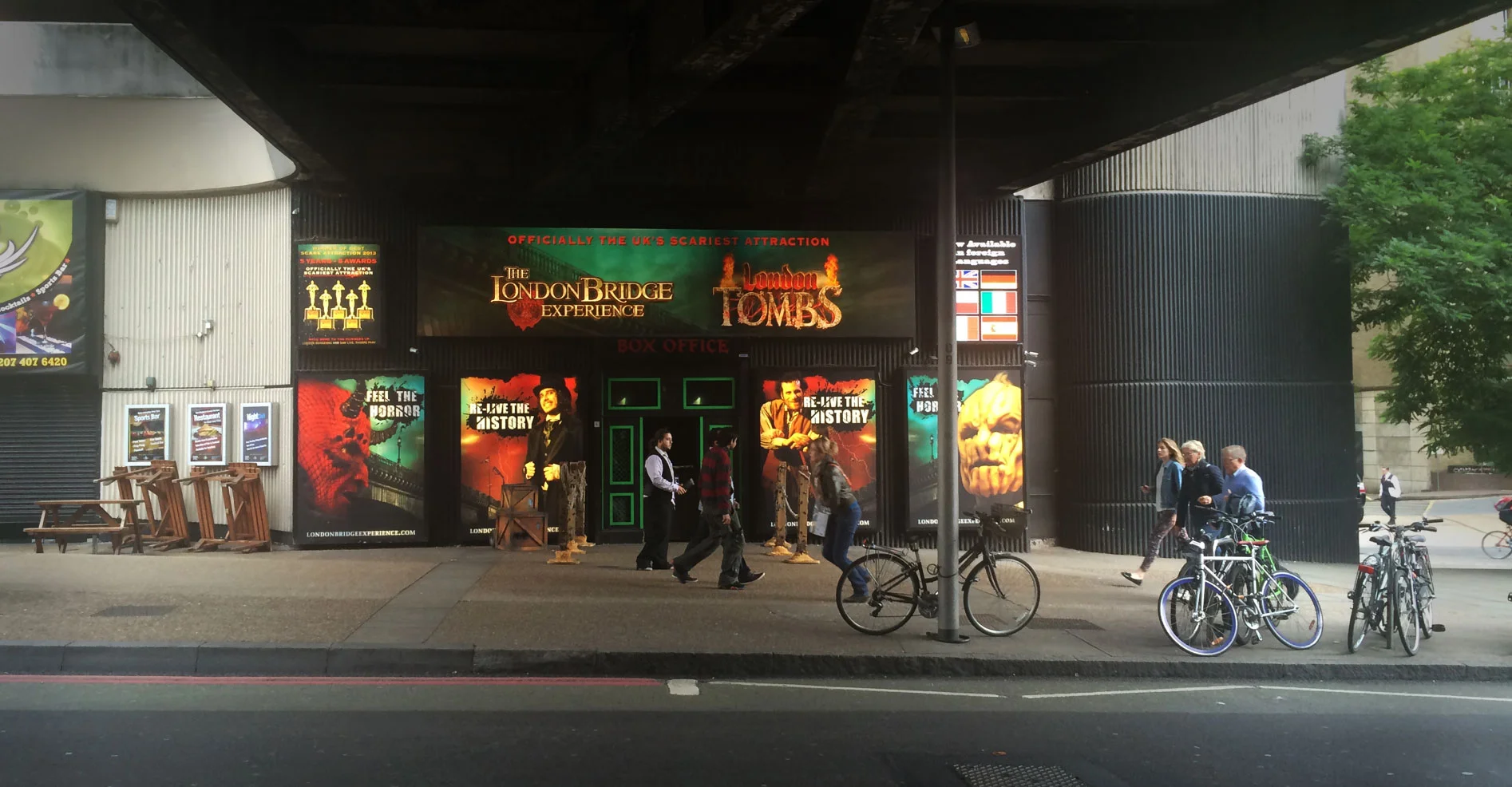
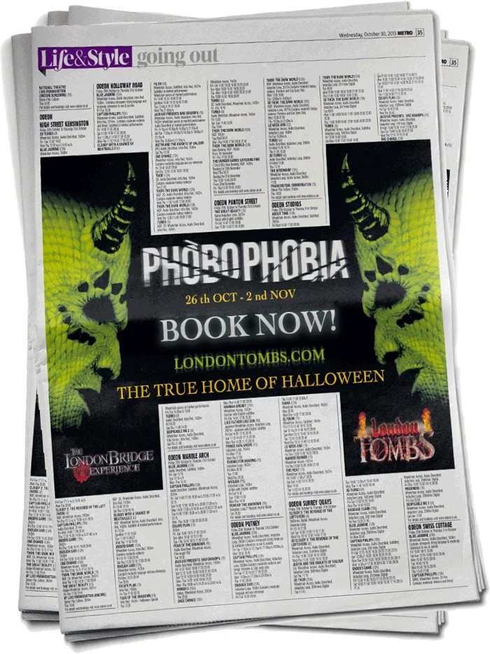
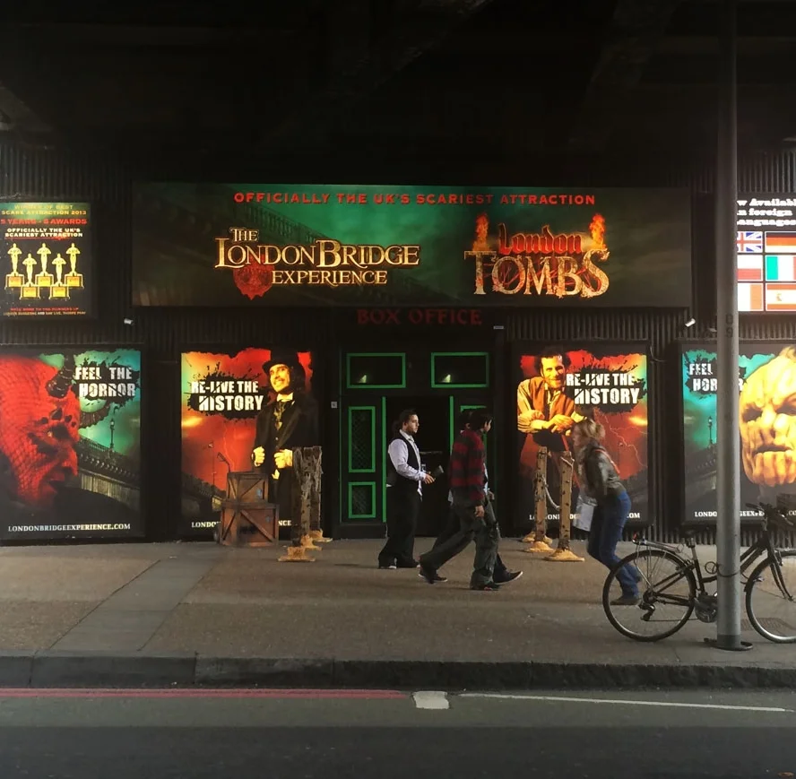
We won the London Bridge Experience & Tombs account while I was Creative Lead at MWI, pitching a year‑long creative strategy to refresh their events programme and increase footfall. The attraction sits in an incredibly crowded market — with the London Dungeon just down the road — so our work needed to create clear differentiation and give people a reason to choose TLBE over better‑known competitors.
We approached the challenge from two angles: perception and events.
For perception, we focused on what made TLBE distinct. While the Dungeon leaned heavily into theatrical horror, TLBE had something more interesting to offer: the history and the horror. That became our strategic anchor — a way to position the experience as richer, more layered and ultimately more compelling than its competitor.
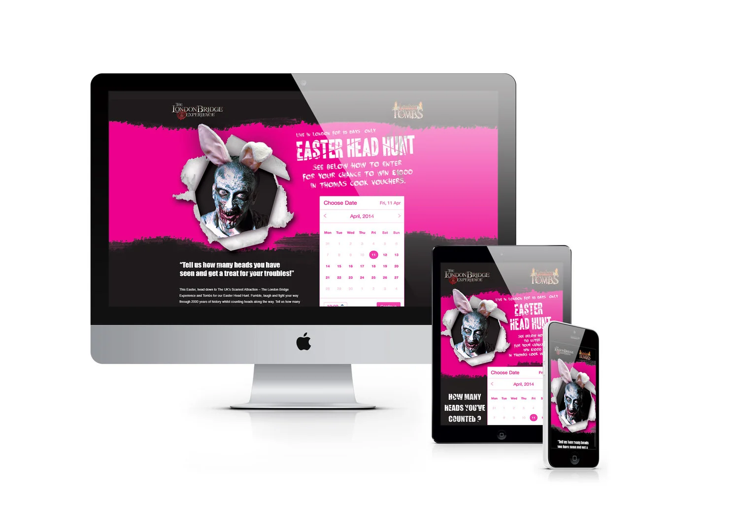
Alongside this, we reimagined their standalone events. The existing offer felt generic, so we introduced a bold B‑movie aesthetic — bright neons, pulpy visuals, and a sense of tongue‑in‑cheek spectacle. This gave us space to create nights that felt like events in their own right, such as Phobophobia and The Easter Head Hunt, both of which were family‑friendly but still visually arresting.
The work spanned everything from hoardings and OOH to landing pages, social content and digital assets. The aim was consistency, clarity and a visual language that could flex across the entire year.
The impact was immediate. After the first six‑month initiative, TLBE was named Runner‑Up for “Best Attraction for Groups” at the 2014 Group Travel Awards — second only to The View from The Shard. They went on to see a 60% increase in footfall, a huge result in such a competitive space.
It was a project that combined strategy, storytelling and unapologetically fun creative — and one that showed how a clear point of difference can transform an attraction’s visibility.
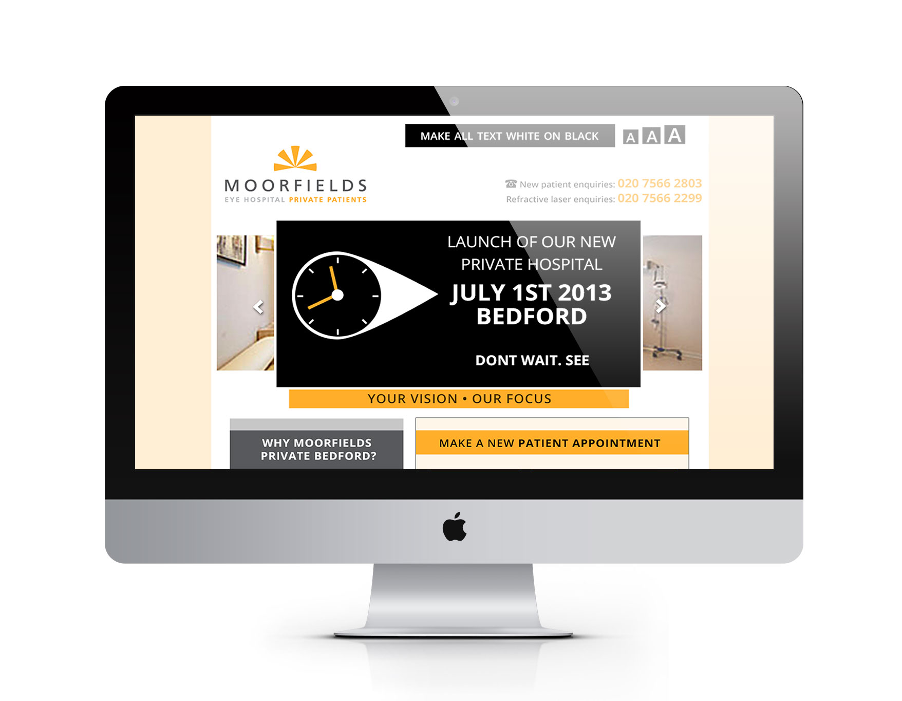
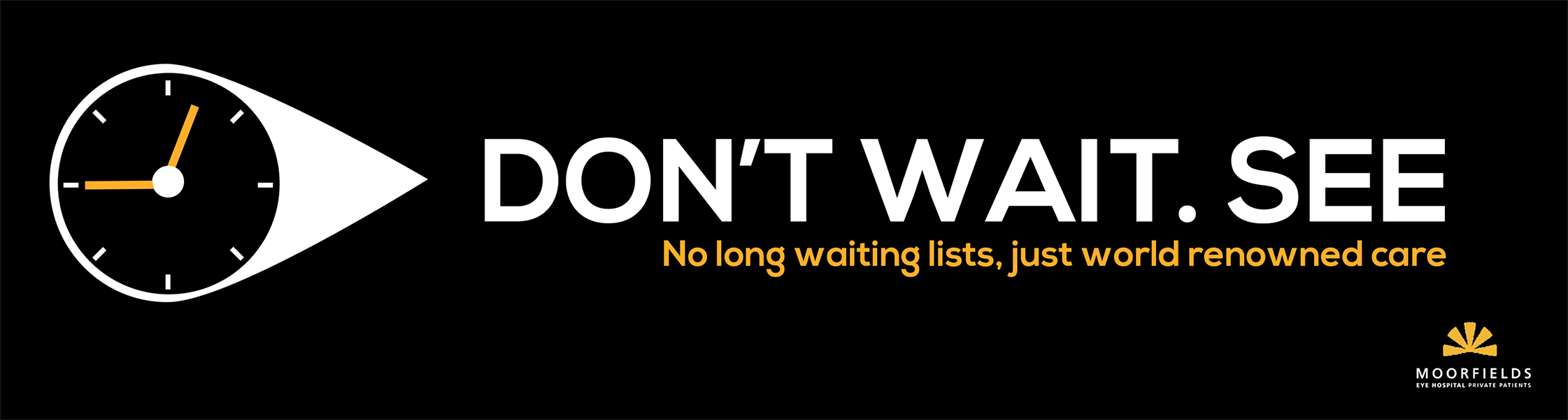
Over the years I’ve worked on a range of healthcare projects where they aligned, from a full rebrand for Vital Europe to a site‑specific, responsive website and TTL launch campaign for Moorfields Private. The work has spanned brand identity, UX, content and campaign development - often in contexts where clarity, trust and precision matter just as much as creativity.