Art Fund
Brand evolution
As Head of Creative, I’ve been leading a significant shift in how Art Fund expresses itself — creatively, strategically and emotionally. The brand was last updated in 2016 and, while much of it still worked, it had begun to feel a little faded and inconsistent, especially in motion and digital. There were also key accessibility issues that didn’t sit comfortably with our mission or tone.
In 2023, I began shaping a new creative direction for the organisation. Working closely with our in‑house team — and consulting with external brand specialists, who supported the original 2016 work — we developed a refreshed design system that reflects who we are now: more connected, more confident, and more rooted in our purpose to make art and culture accessible to everyone.
From channeling to expanding
Strategically, we were evolving from being seen primarily as a funder to being understood as an organisation that actively expands access and experience. We needed a visual system that could grow with that shift.
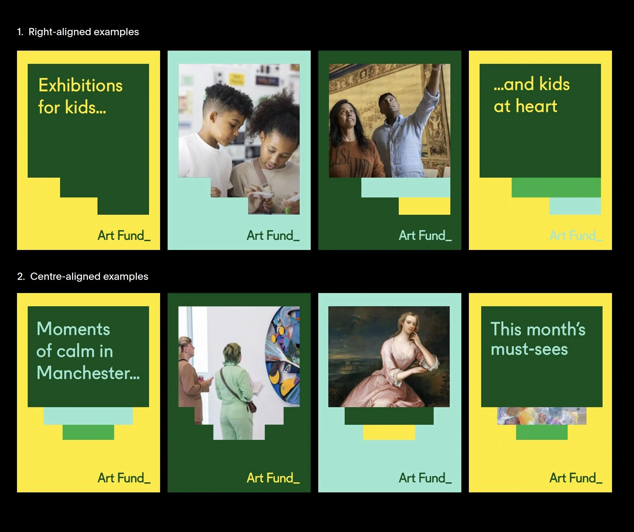
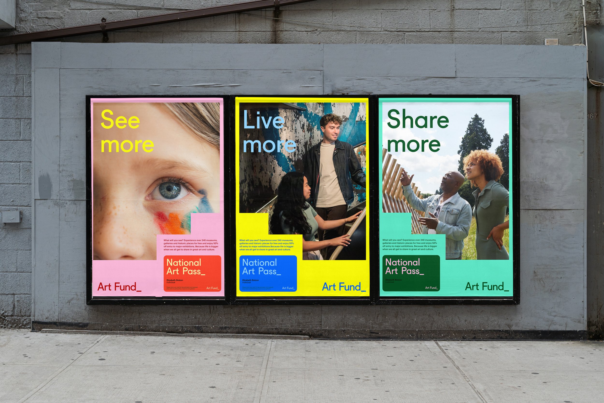
Inspired by Josef Albers’ theory of colour, we began to see Art Fund as a kind of beacon — something from which energy, ideas and possibility radiate. We explored motion, scale and space; we expanded the colour system with accessibility at its core, achieving AA and AAA contrast combinations. The result is a system that feels bolder, more dynamic and more reflective of the sector and communities we serve.
In the frame video series
Co-created and inclusive by design
A key part of this work was embedding inclusive practice from the start. We partnered with the Diversity Standards Collective to test and evolve the system across lived experience — going beyond guidelines to understand how tone, form and space can support inclusion in a meaningful way. This shaped everything from colour and contrast to representation and narrative.
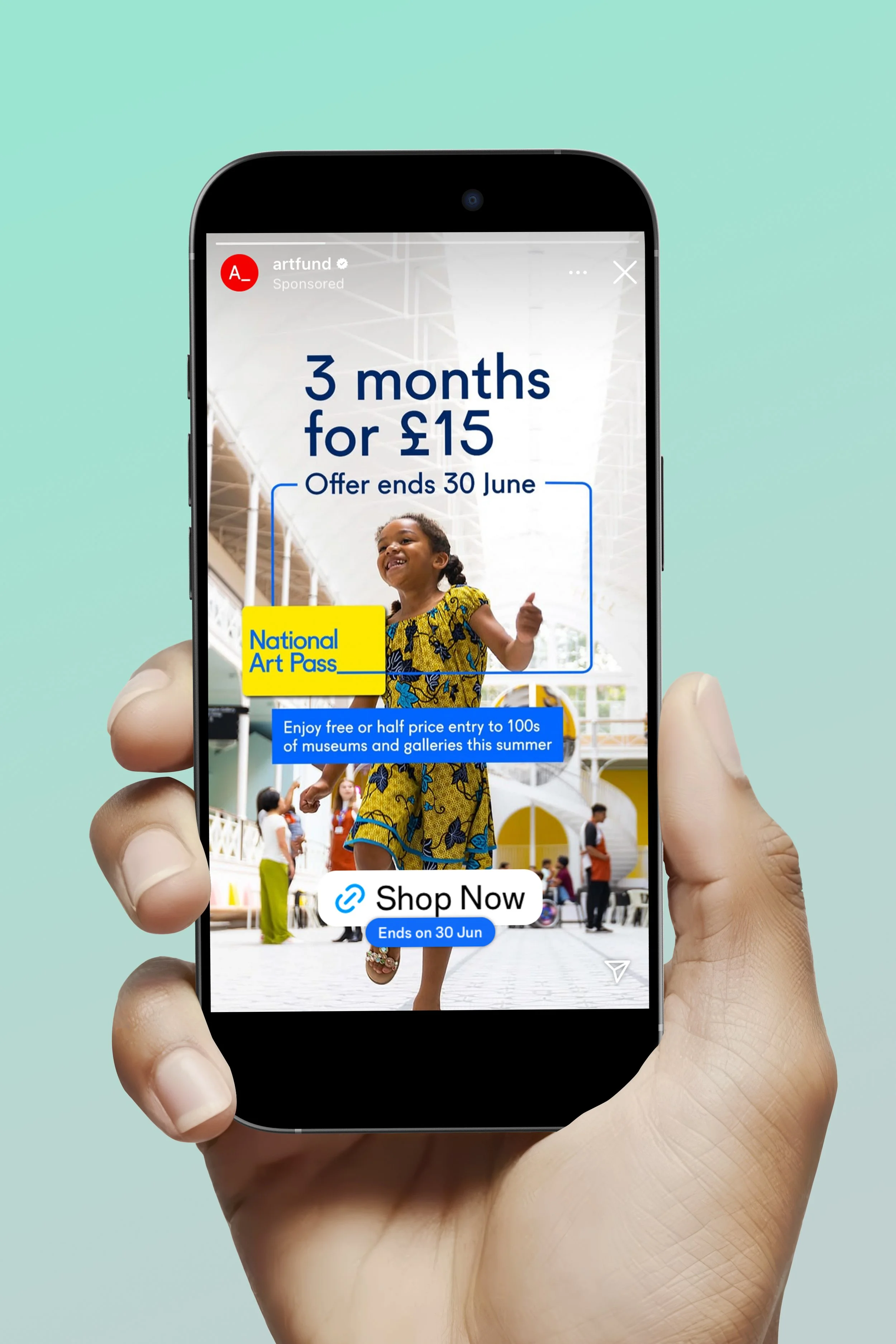
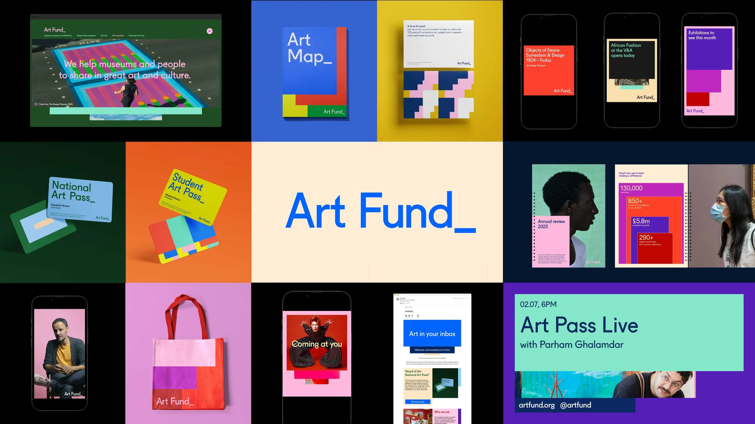
Design that meets people where they are
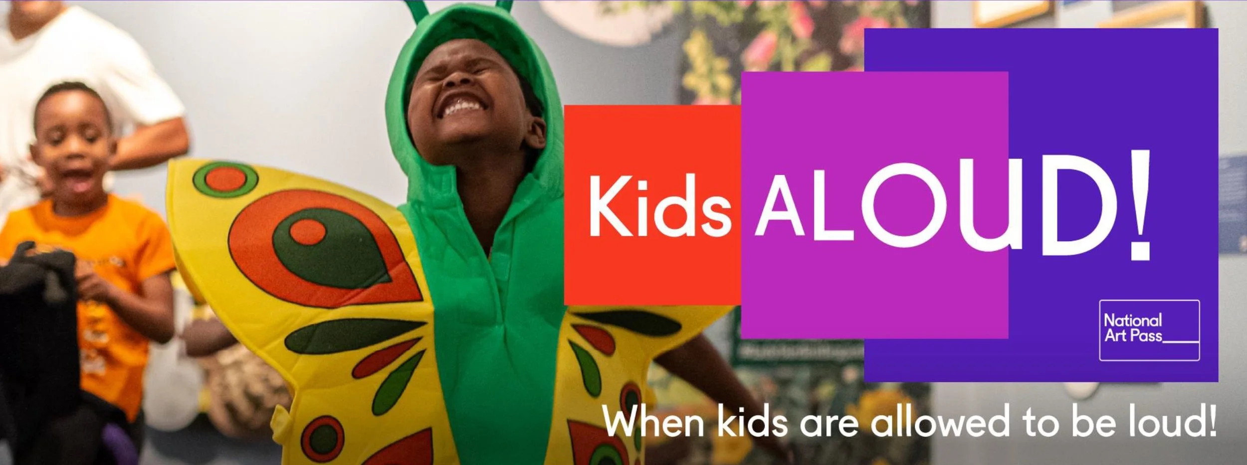
The new visual framework flexes across audiences and channels — from museum professionals and artists to day‑trippers and families — and works consistently across the website, social, print, National Art Pass campaigns, Kids Aloud and our wider partnerships.
It also unifies areas of the brand that once felt separate. Our family‑focused comms now sit naturally within the broader system, rather than operating as their own visual language.
A more coherent, expressive identity
We’ve rolled out the new identity in line with our updated tone of voice, and while there’s more to come, I’m proud of how far we’ve already travelled. It’s the most cohesive, flexible and expressive identity Art Fund has had — and it’s built to welcome more people in.