Art Fund
Brand evolution
Art Fund’s brand was last updated in 2016 – and while much of it was still working, it had started to feel a little… faded. Whimsical. Inconsistent. Especially in motion and digital. There were also key accessibility issues, particularly with our pastel palette and its legibility across platforms.
So in 2023, I began leading a significant shift in how we express ourselves as a brand at Art Fund. Working closely with our in-house team and also consulting with external brand specialists from Wolf Ollins who had helped craft the work in 2016 - we created a new design system that reflects who we are now – connected, vibrant confidently rooted in our mission to make art and culture accessible to all.
From channeling to expanding
Strategically, we were evolving from being seen as an organisation that channels funds and resources, to one that actively expands access and experience – and we needed a visual identity that could grow with that.
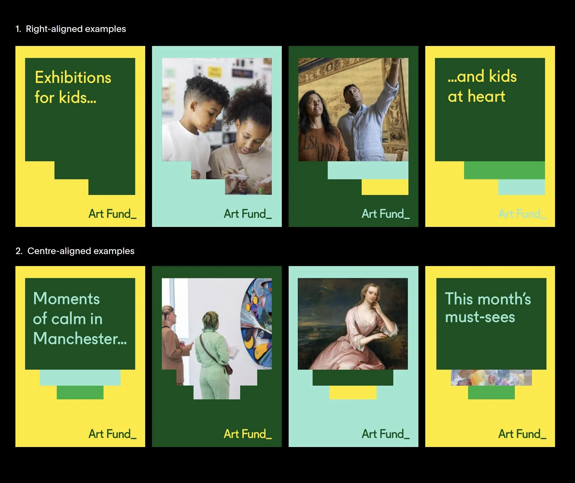
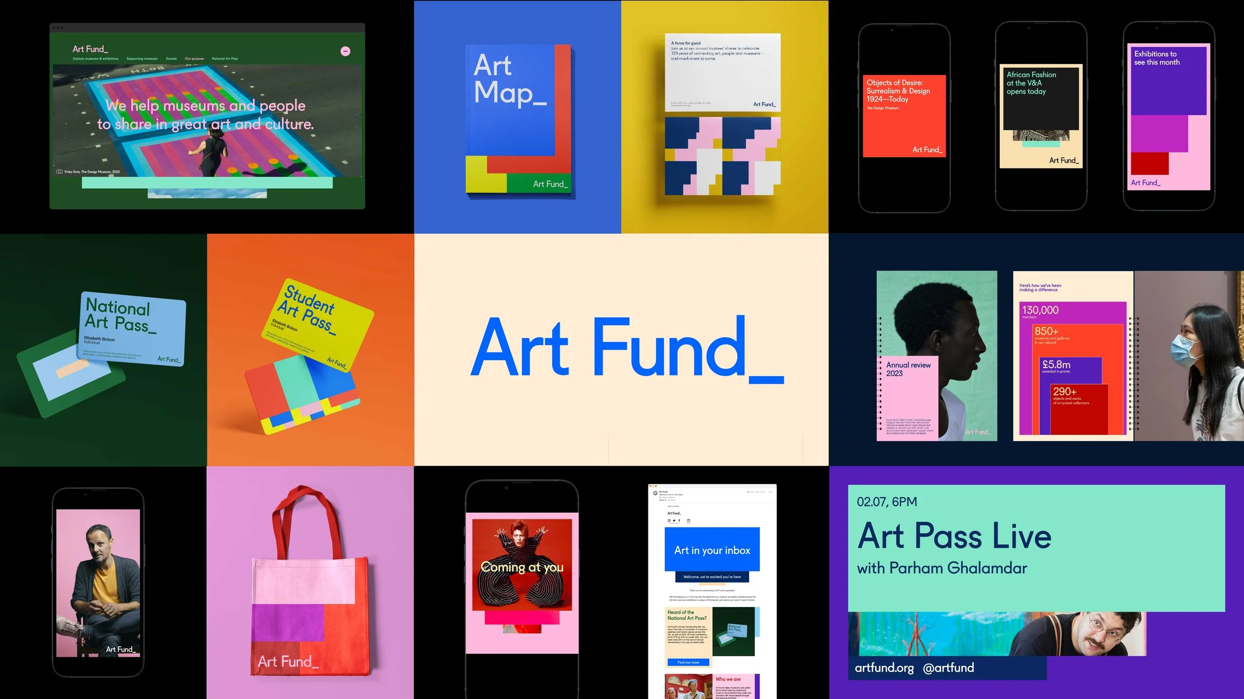
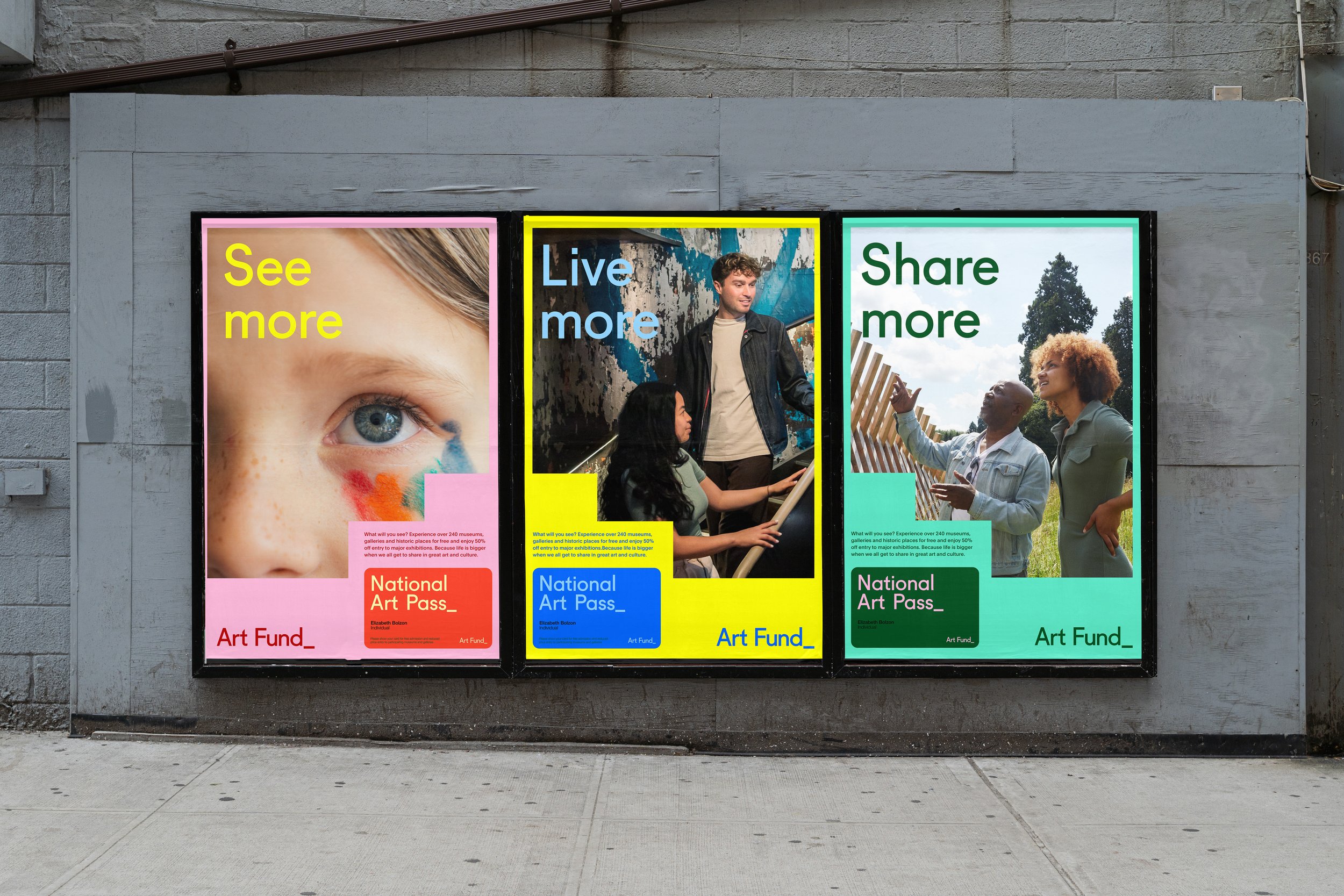
Inspired by Josef Albers’ colour theory and the idea of Art Fund as a beacon – something from which energy and ideas radiate – we began experimenting with motion, scale and space. The underscore became something bolder, more dynamic. The colour system was expanded with top-tier tones to give us accessible AA and AAA contrast combinations. It’s a system that reflects both the sector we serve and the people we want to reach.
In the frame video series
Co-created and inclusive by design
Throughout this process, we’ve worked with the Diversity Standards Collective to test and refine how our design system holds up across lived experience – running both written and live creative councils. That collaboration has been critical, especially in thinking about how colour, form and space can support inclusion, not just aesthetic appeal.
Design that meets people where they are
We’ve built a visual framework that flexes – whether we’re talking to museum professionals, artists, researchers, or first-time art lovers.
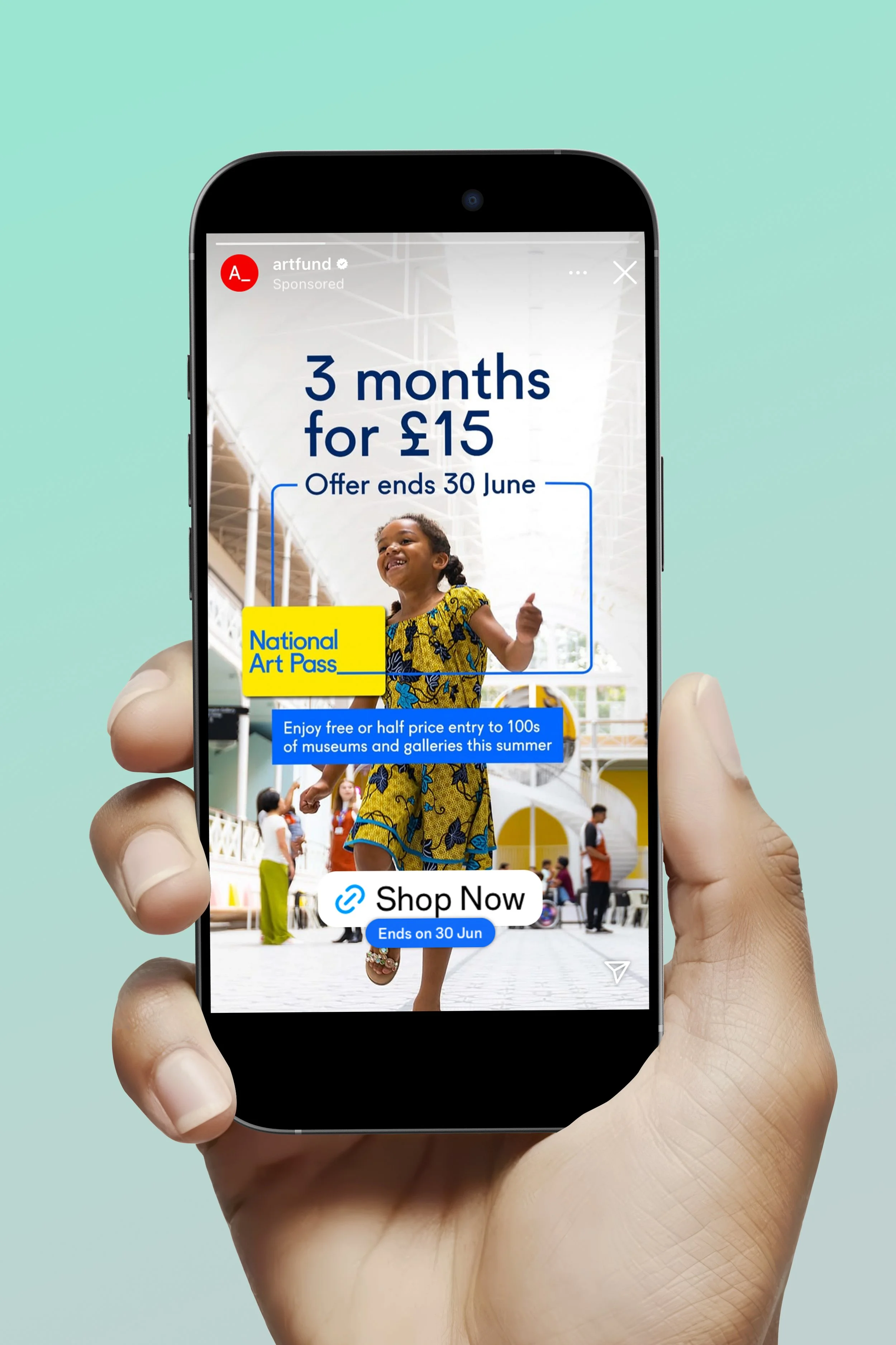
It works just as well in motion as it does in static and print – which is vital, given how many museums rely on our resources. It scales up for playful, digital-first campaigns like the Student Art Pass, and pares back for our more advocacy-based work.
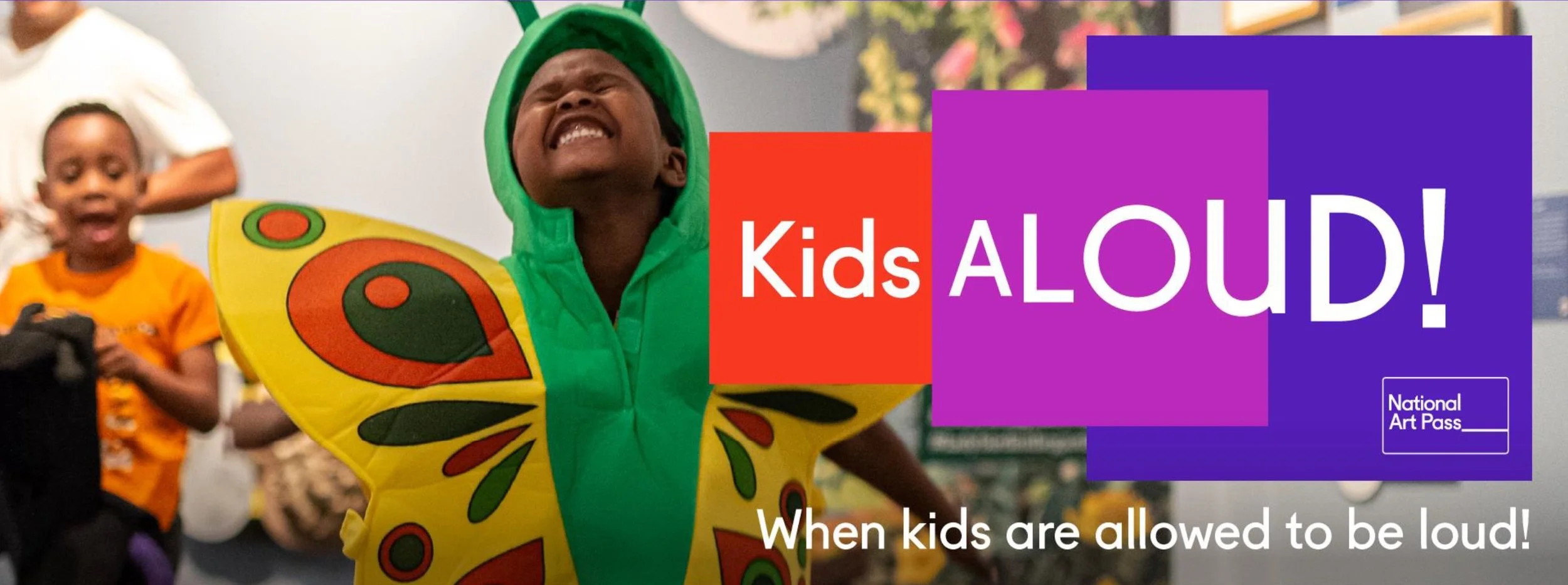
And importantly, this evolution has helped us find our voice with families and younger audiences (as you can see below).
Before this, we sometimes struggled to speak to children and parents in a way that felt natural and creatively distinct. Now, we’ve got tools to help us be vibrant, joyful and clear – without ever feeling off-brand. From early years campaigns to major participation projects like The Wild Escape, our family-focused comms finally feel like they belong.
We’re now beginning to roll out the new identity in step with our updated tone of voice – and while there’s still more to come, I’m proud of how far we’ve come already. It’s the most cohesive, flexible and expressive identity Art Fund has had – and it’s built to welcome more people in.